Page 1 of 3
channel display toolset request
Posted: Sun Feb 22, 2009 3:09 pm
by thibaud
Hello Pierre ... and everyone

It could be nice to have the "use alpha" and "show mask" (why is it not labeled "show alpha" btw ?) somehow integrated into the viewer bar - (I could design icons for that if you are interested)...
but what would actually be even better, is to have theses functions integrated into an extended "channel manager/selector" toolset on the viewer's toolbar that would provide:
1.instant visualization of the available channels for any selected image
2.quick selection of the channel to use/display.
the advantage of such a toolset would be amazing for image formats holding multiples channels/layers like exr, rpf, etc.. while still providing enhanced usability for more popular format. (being able to display rgba channel individually would alreay be nice)
what do you think ?
can't wait for the next version of MP

Re: channel display toolset request
Posted: Sun Feb 22, 2009 4:29 pm
by oops66
Hello,
I agree, an extra toolbar (with for example, some boxes to check or uncheck) is a good idea for quickly enable or disable the "layers" (channels : Red,Green,Blue,Alfa. + "show transparency" + "show mask" + "apply the ICC Profile" + "show Grid" + ...) and maybe with the possibility to add or subtract an (or some) other(s) channel(s) from an other image.
Posted: Wed Feb 25, 2009 2:51 pm
by thibaud
here is a mockup of how I imagine it could be:

what do you think ?
Posted: Wed Feb 25, 2009 4:21 pm
by JohnFredC
Extremely well done, Thibaud.
...and I like the chromatic icons better than the monochrome ones.
How do you see the grid option working?
Posted: Wed Feb 25, 2009 4:23 pm
by thibaud
if nested dropdown in toggle button is too much, you could off course simply enable/disable the dropdown with the 'aux channel' toggle button just next to it:

Posted: Wed Feb 25, 2009 4:30 pm
by thibaud
JohnFredC wrote:
How do you see the grid option working?
to be honest I never used it.

there is a display grid button already present in MP viewer toolbar.
i just slightly changed it and placed it along the other display function buttons
Posted: Wed Feb 25, 2009 4:38 pm
by JohnFredC
I see...
I thought perhaps you meant to imply a grid specific to the channel functionality... perhaps for displaying a "pixel" grid on an image. This would differ from the current use of the generic XnView grid (which is already much - if incompletely - improved in MP)
...perhaps your approach could extend to HSL, also.
...and be available in the Compare panel.

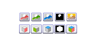
Posted: Fri Feb 27, 2009 4:27 pm
by xnview
What do you think :
Posted: Fri Feb 27, 2009 4:52 pm
by thibaud
exellent, my vote for second line (with cubes).
Posted: Fri Feb 27, 2009 5:07 pm
by JohnFredC
Those are nice to look at but I think they are confusing.
If a user is coming to XnView from the 3D modeling software world, a cube with one face filled implies something entirely different from "channel".
A user might confusedly think that the face refers to an x, y, or z axis, a camera view, or a construction plane.
If it sounds weird that such a misinterpretation might occur within the context of a GUI for viewing color channels, IMHO the 3D software realm has already staked a claim to what those visual metaphors mean to most users.

Posted: Sun Mar 01, 2009 4:19 pm
by xnview
So the first one is better?
Posted: Sun Mar 01, 2009 4:35 pm
by JohnFredC
xnview wrote:So the first one is better?
The first group is better than the second group, but not as good as Thibaud's.
Honestly, I think it is important to include the "R", "G", and "B" in the icons. That way there will be no ambiguity about what they represent.
Perhaps a good solution would be your first group overlaid/composited with the letters representing the channel colors.
Posted: Sun Mar 01, 2009 5:38 pm
by thibaud
personally i have no prob with the second group, I find it really good.
much better than the the first group imho (alpha channel is so directly identifiable)
actually i find them much more readable than what I did.
Posted: Sun Mar 01, 2009 5:59 pm
by oops66
Personally I vote for the second group and the first line (the landscape ,and the alpha channel here, is really directly identifiable), I also like the RGBA but the RGBA is mostly intuitive in English (so not in all Languages), and I also think than the 3D cubes concept must be reserved for 3D functionalities.
But for me, at least one icon is missing:the bistable function :"apply the embedded ICC Profile on the fly" for this picture !
PS: The alfa channel icon function in this case, also means for me, apply(on/off) the png, ... alpha channel or the gif transparency.
Posted: Sun Mar 01, 2009 7:28 pm
by thibaud
(the landscape ,and the alpha channel here, is really directly identifiable)
How many landscape photo to you have that hold a relevant alpha channel ?
Most of the image that are generated with a usable alpha channel are actually very often coming out of a 3d renderer precisely... (hence the relevance of the 3d cube)
I also like the perfect match of the 3 visible faces with the 3 (rgb) channels. where in the first line, having that same mountain visible in red, green, blue make little sense when you think about it.
and I also think than the 3D cubes concept must be reserved for 3D functionalities
Yeah right, there is so many 3d functions in xnviewMP.

PS: The alfa channel icon function in this case, also means for me, apply(on/off) the png, ... alpha channel or the gif transparency.
that is the last icon function: 'use alpha' ,
the black and white icon is for 'show alpha'.