XnViewMP new icon
Moderators: helmut, XnTriq, xnview

Re: XnViewMP new icon
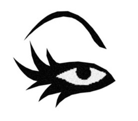
I like this monochrome prototype version too, but maybe with the four XnView lashes as usual ?

XnViewMP Linux X64 - Debian - X64

Re: XnViewMP new icon
I think that the new logo must be similar to the old one like first proposal. But i think that the text is now better in last proposal...
Pierre.
Re: XnViewMP new icon
I wanted to say the same! It should use the same colors (orange/red), it should look like eye, I like the last one too - perhaps I'd add 4 "dots" like in the old icon, but it looks good even without it.xnview wrote:I think that the new logo must be similar to the old one like first proposal. But i think that the text is now better in last proposal...
Dreamer
Re: XnViewMP new icon
I really like this logo. Clean and colorful, and this 16x16 verion is quite recognizable.thibaud wrote:may I express some concern regarding the readability of this icon at 16x16.
slightly optimized previous proposal for 16x16


However, althought I think it has already been asked, PLEASE move the swirl to the top, in order to leave some "blank" at the bottom.
A "normal eye" is prone to be white on the bottom rather than on top (here, or here, or logo1 and logo2)
Re: XnViewMP new icon
Combine the design mark from this:
with the text from this, but with a bright x and a gray view:

and i think we have a winner.
with the text from this, but with a bright x and a gray view:
and i think we have a winner.
Get the bugs fixed, THEN start adding features. It sucks, but someone has to do it.
Re: XnViewMP new icon
I think Pierre asked just for the opposite.I believe his concern was that you're supposed to read Xn and not XN. (that's the reason I changed the typo design..)
I will be away for a few days and won't be able to update until then.
I will be away for a few days and won't be able to update until then.
Last edited by thibaud on Wed Dec 23, 2009 2:35 pm, edited 2 times in total.

Re: XnViewMP new icon
I also would prefer a combination of the icon/symbol from the first example and the text from the second example.
Perhaps:
1. There should be more space between the icon and the text. Currently the icon position obfuscates the text.
OR
2. Instead of the icon preceding the text, perhaps it should be in-line with the text, substituting for the "e" in "view".
After all, the lower-case "e" is a close to an eye as you get in the western alphabet.
Worth a try.
PS. The second icon still looks goofy as per my previous posts. The feature that ruins it for me is the shape of the eyelashes. Eyelashes need to be pointy... or they are not eyelashes, just nubbins that tend to pull the connotation away from "eye" toward the other things I mentioned above.
PPS. If the "color" schema for the logo is to be this dark monochrome (which I like), then the default MP theme should match it closely. The attractiveness of thibaud's examples depends very heavily on the ground on (in) which they sit. They don't look so great on light blue, for instance.
I love the dark Lightroom/Aperture look (very very professional), but not everyone does.
John
Re: XnViewMP new icon
Something like that, but with "XnView" text and not "XNVIEW"Danny wrote:
Pierre.

Re: XnViewMP new icon
There's a lot to like about the latest draft, methinks:
- Well-balanced mix of straight letters and italics
- “xn” has been set apart from “view” without breaking the name in half
- Shadow on link between “n” and “v” adds third dimension
- Pupil of the eye and dot on the “i” make for visual integrity between logo and signet

Re: XnViewMP new icon
This pic is the Eset Nod32 2009 logo extracted from it's main executable. I then looked at the pic and rotated it in xnview to 45 degrees, applied and then rotated a second time again to -16

One could recolour this and add the same eye centre swirl of Thibaud's. Additionally the 4 "dots" as eyelashes (or maybe keep it at 3) would be added?
Personally I like the rotated 'Eye' logo and this time someone could try doing an overall red colour with orange/golden swirl:

I dunno I'm just trying to stir ideas up
One could recolour this and add the same eye centre swirl of Thibaud's. Additionally the 4 "dots" as eyelashes (or maybe keep it at 3) would be added?
Personally I like the rotated 'Eye' logo and this time someone could try doing an overall red colour with orange/golden swirl:
I dunno I'm just trying to stir ideas up
Re: XnViewMP new icon
Here is a crude modification of Thibaud's proposal illustrating what I meant in my previous post: Substitute an eye for the "e".


John
Re: XnViewMP new icon
Yes. And when ready, this same texted version could be used for multiple flagship uses especially as a banner for the top of this forum, main website and maybe in software as the 'About' logo.JohnFredC wrote:Here is a crude modification of Thibaud's proposal illustrating what I meant in my previous post: Substitute an eye for the "e".
btw I see you have some agreement like I do with a 'rotated' eye

Re: XnViewMP new icon
Good discussion and desgin efforts, here! 
In the above draft, there are two letters which are sort of obscured, the "v" and the "e". I think the "xnview" is a bit too hard to read this way. Just my 2cents...budz45 wrote:JohnFredC wrote:Here is a crude modification of Thibaud's proposal illustrating what I meant in my previous post: Substitute an eye for the "e".
Re: XnViewMP new icon
I agree.
The eye shape both needs to be more prominent and to be more "e" like, perhaps with shadowed overlaps as the "n" and "v" are.
As regards to spacing between "n" and "v"...
...thibaud's overlap between them is a specific style conceit used frequently in logos. Part of its design vocabulary is the forced geometric continuity between the letter shapes. Very attractive. Unfortunately, the continuity tends to blend the shapes, too, and make them harder to distinguish/read (as here).
Spreading them apart would restore some individual identity to each letter, but with a reduction in the quality of appearance of their overlap. It's simply a design problem, and I am sure thibaud can solve it.
Here's one approach:

John

Re: XnViewMP new icon
• I like your approach, specially the colours and the engraved style making the logo close to the optimal, IMHO…
Claude
Clo
Old user ON SELECTIVE STRIKE till further notice •