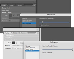
There are essentially two flavors of chromatically neutral UIs:
1.) The "dark" approach has been employed by almost all so-called "professional" software (Aperture, Lightroom, et al) for several years now. I remember when Lightwave (3d modeler) switched to a dark theme many, many years ago, how attractive and functional it was compared to the M$ UI designs. Apparently other developers thought so as well. One benefit to professionals for the dark themes currently popular is their chromatic neutrality. In particular, adjustments for photographic color/exposure are more accurately compared/estimated in chromatically neutral UIs. One might think of the benefit as the "gray card" or "zone" effect... in deference to the neutral-gray exposure-reference cards employed by professional photographers everywhere.
2.) The "light" approach originated in the distant past of DOS graphics programs and is currently championed primarily by Picasa and a few others. It is also a chromatic-neutral UI, but is not (what I refer to as) "gamma" neutral, in that the predominance of white surfaces displayed by the UI tend to suppress/compete-with photo light/dark balances. Images tend to look duller and less colorful in contrast to the white. From personal experience I tend to slightly over-contrast and over-saturate images edited in Picasa.
Conversely, if the interface is too dark ("black"), then gamma-neutrality is compromised as well and the user might tend to under-contrast/under-saturate images...
My opinions:
- • As long as the default theme is attractive, chromatically neutral (see above), AND (very important) MP exposes a UI surface control for changing the theme, it seems to me that a default theme ("dark" or "light") should be chosen based on the anticipated audience for the software.
• I would also opt for a "gamma" neutral theme (not too dark, not too light).
• Perhaps if MP looks like Picasa by default ("light"), then professionals may not give it a chance (since, of course, no "professionals" would ever use a free tool like Picasa ha ha). This is somewhat likely, IMO. OTOH the public at large might be more easily attracted.
• If MP looks like Lightroom by default ("dark"), then the "common" man may be intimidated, thinking (by association) that MP is a professional tool and too hard to use. I think this is less likely to occur, however.
• If the user employs an MP install program (Setup), then it is a simple matter for the setup routine to provide several different themes (light, dark, medium, colorful) to chose from. This would be the best approach.


